USABILITY AND MOBILE APPLICATIONS 1 - Exercises | WEEK 1 - WEEK 3
27 March 2018 - 10 April 2018
Aurelia Regina Sutjahjokartiko, (0329953)
Usability and Mobile Applications 1
Exercises
Lecture - 4 April 2018
On this day, we learn about what is USABILITY ? and why we learn USABILITY before we touch how to make mobile apps. So, Mr Shamsul asked us to read 2 e-book that he gave us.
So here my notes about that :
One defined about usability that attract me to read is from Lecerof (1998).
"Lecerof et al. (1998) provided usability
definition by addressing relevance of a system to users’ needs, efficiency, users’ subjective feelings, learnability,
and system’s safety feature, such as granting users the right to undo actions that may lead to errors."
Next, in the result and discussion section, they serve percentages of attributes in usability.
The smallest percentage of usability attributes with 2% are
1. advance feauters
2. communication
3. error
4. error-tolerance
5. first imperssion
6. operability
7. training
Exercise - 5 April 2018
Good and Bad applications
On this day, Mr Razif asked us to find application that we have in our phone and this exercise, we did it on our group which are Aryna, Chalani, me, Vivien and Paulina. For the good app we chose Zalora app (that Aryna like and preferable) and the bad one is Chilindo.
Chillindo app is mobile application for user to bid an items that they like and bid based on their price. You will get the item when you give the highest price than others.
From this app, i found the bad factors, here is my explanation.
This history navigaton for me is redundant. Because a lot tab and table that they show to user. Instead of 3 tabs that consist of "Active", "Win", and "Lose", they can simplified with 2 tabs which are "Active" and "History" tab. So that history consist of 2 tables are "Win" and "lose". And for Active tab, like what they did before for the table
On this app, the most crucial and important menu is there. What i mean is "Customer Service" or "Contact Us" info is not there / available to click it. Because, sometimes users have a problem with this application/ bid system/ order systems and etc, then they want to report it. But there is no menu to contact Chilindo Team. In other words, users need to open google and search Chilindo call number. So, this is not effective.
Exercise - 10 April 2018
On this day, Mr Razif gave us practice about Information Architecture, UI & UX group exercise. In this exercise, he asked us to remake the placement of Airasia Boarding Pass. Here it is,
After me and Vivien look and identifying this boarding pass, here is our result of our identification,
Feedback
10 April 2018
Nice idea for folded system and make the boading pass into 4 square. Simple and clear to see.
Reflections
References
Aurelia Regina Sutjahjokartiko, (0329953)
Usability and Mobile Applications 1
Exercises
Lecture - 4 April 2018
On this day, we learn about what is USABILITY ? and why we learn USABILITY before we touch how to make mobile apps. So, Mr Shamsul asked us to read 2 e-book that he gave us.
So here my notes about that :
One defined about usability that attract me to read is from Lecerof (1998).
"Lecerof et al. (1998) provided usability
definition by addressing relevance of a system to users’ needs, efficiency, users’ subjective feelings, learnability,
and system’s safety feature, such as granting users the right to undo actions that may lead to errors."
Next, in the result and discussion section, they serve percentages of attributes in usability.
The smallest percentage of usability attributes with 2% are
1. advance feauters
2. communication
3. error
4. error-tolerance
5. first imperssion
6. operability
7. training
And the largest percentage of usability attributes is Learnability with 20%.
But there is another attributes that important for me. The attributes are learnability, satisfaction, efficiency, effectiveness and memorability and errors
1. Effectiveness : how that app achieve the user goal towards application that they use
2. Efficiency : Can that app handle a lot of multitasking? how many user needs taps to get what they want? Is the app faster responsive ? How fast the app launch?
3. Learnbility : how fast the user learn the app / how the user know about the app
4. Memorability : user is able to return to the
system after some period of not having used it, without having to relearn/run through everything
5. Errors: users make few errors when using the system;
6. Satisfaction : user satisfied
When should the Usability Testing done?
Here is diagram to understand
 |
| Figure 1. Diagram of Usability Testing |
Basicly, everytime you need to do it. When you research and try to make and concept idea. When you design the placement, navigation, the appearance and etc, is it complicated when an user try to use it? When after development and before release the app on public to prevent embarrased.
In future, research will be to model the relationship among
usability attributes and its impact on usability of system in different environment. For example, software system
may be use in technical environment or in social environment, and then different usability attributes may have
different impact on the system.
Exercise - 5 April 2018
Good and Bad applications
On this day, Mr Razif asked us to find application that we have in our phone and this exercise, we did it on our group which are Aryna, Chalani, me, Vivien and Paulina. For the good app we chose Zalora app (that Aryna like and preferable) and the bad one is Chilindo.
 |
| Figure 2. Chillindo logo |
From this app, i found the bad factors, here is my explanation.
 |
| Figure 3. First page of the app |
Here is the example if you open the app. So clean but the bad factor is the design cannot attarct people to buy that items. (Maybe because it is so cheap and import from China)
 |
| Figure 4. Hamburger menu |
Here is the hamburger menu that consist of it. What i found from this app is there is no search feature so we consider this app bad. Because when the user want some an item that they like but the list item so complicated, so they want to search. But if there is no search feature, they will force to close this app.
 |
| Figure 5. History bid |
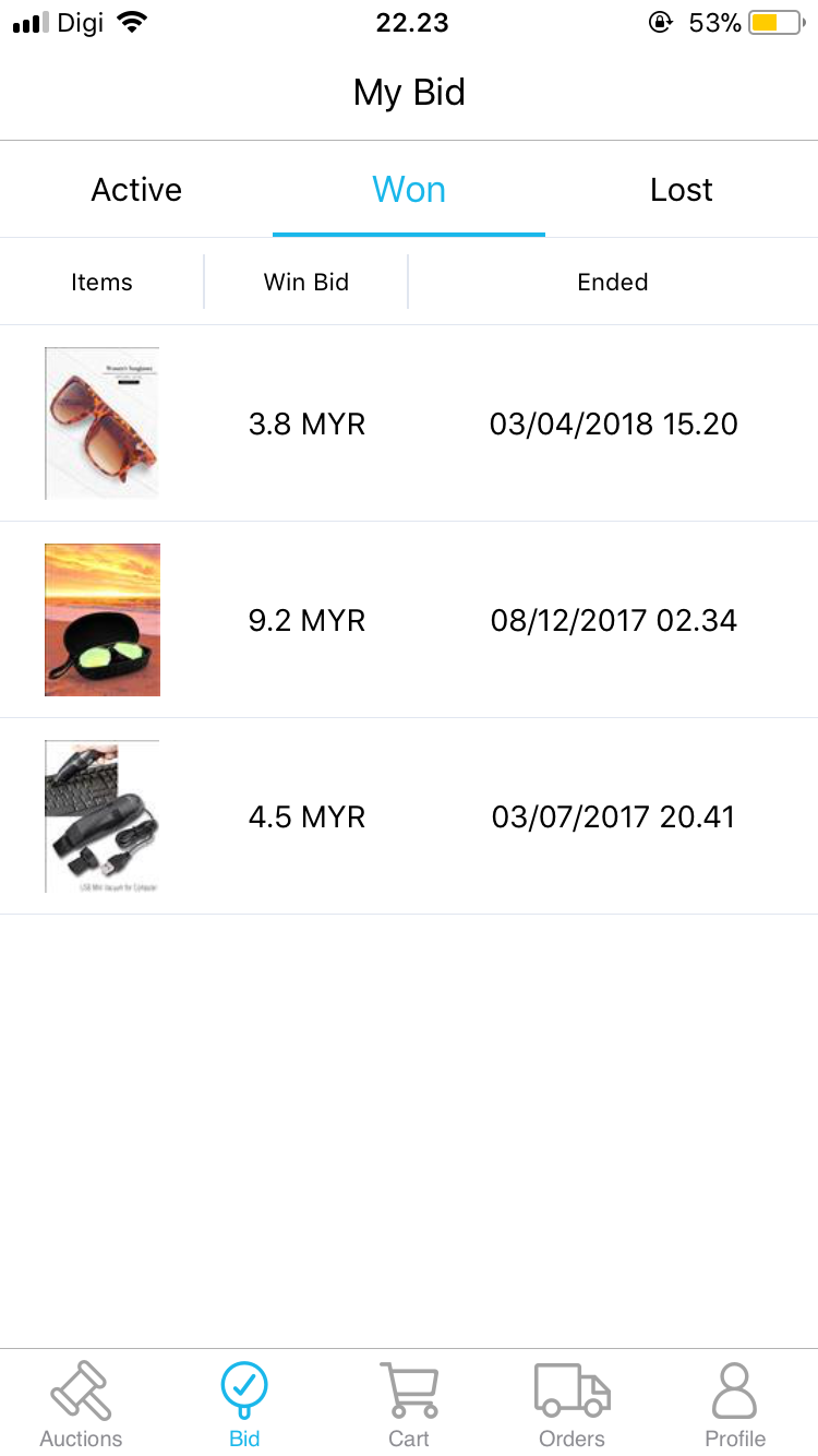 |
| Figure 6 . History bid (win) |
 |
| Figure 7. History bid ( lost) |
This history navigaton for me is redundant. Because a lot tab and table that they show to user. Instead of 3 tabs that consist of "Active", "Win", and "Lose", they can simplified with 2 tabs which are "Active" and "History" tab. So that history consist of 2 tables are "Win" and "lose". And for Active tab, like what they did before for the table
 |
| Figure 8. Profile Menu |
 |
| Figure 9. About Chillindo menu |
Exercise - 10 April 2018
On this day, Mr Razif gave us practice about Information Architecture, UI & UX group exercise. In this exercise, he asked us to remake the placement of Airasia Boarding Pass. Here it is,
 |
| Figure 10. Airasia Boarding pass (2010 version) |
TARGET :
people who’s flying, people who booked the ticket. Boarding pass to be printed or just to see on screen. Older people pay attention more. Boarding pass if printed, usually people will place it in between their passport.
SPECIAL OCCASION FOR OLDER PEOPLE:
Design must be Legible. Font size must be big. Order it in order of importance. Highlight what’s important.
What people usually see and recheck in the ticket, in order:
1. Flight date, Departure and Arrival
2. Flight Number
3. Boarding time, Gate Close, Gate number
4. Boarding sequence
5. Seat no.
What airport workers need to see and check repeteadly
1. Flight number
2. Flight date
3. Barcode
4. Name
Based on Regina's experience :
1.Date supposed to be shown bigger (website)
2. Gate number supposed to be shown bigger
What’s Bad :
-The ad is in the centre, it’s placed on top of the important notice.
-Small texts, hard to read. Especially for senior citizens.
-Looks cluttered, too much things. Some information is redundant
-Baggage information can be simplified.
-For people who print their boarding pass, it’s a bit of a hassle to carry around A4 paper size coz it can get creased and folded.
-Reading direction is confusing.
-There’s two barcodes and the placement is not aesthetically pleasing.
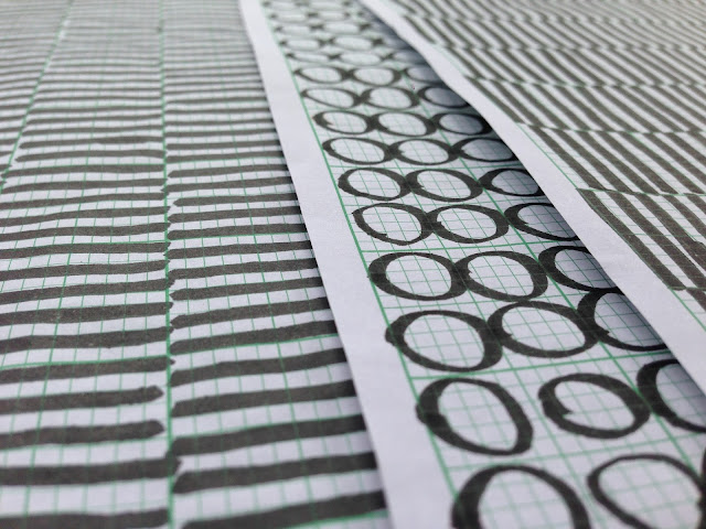
After we are identifying between bad and good, we decided to make mind mapping first and remake this.
 |
| Figure 11. Mind Mapping to remake Airasia Boarding pass |
Here is our remake result of Airasia Boarding Pass:
 |
| Figure 12. Size A4 boarding pass |
 |
| Figure 13. Folding mode |
We decided to make 4 square in one A4 size (folding mode) because usually traveller always put their boarding pass inside of their passport since it is handy. Furthermore, from Airline team side, they need airline copy and also the ads should be there. Thats why, we come up with this and the boarding pass not easy cluttered or bad folded.
Second reason, we simplified step by step information and bag information because the older is hard to see and understand. Thats why we remake like timeline mode and big icon there.
Furthermore, we put the bardcode on below because is easy to scan since it is edge.
Feedback
10 April 2018
Nice idea for folded system and make the boading pass into 4 square. Simple and clear to see.
Reflections
References


Comments
Post a Comment