WEEK 6–WEEK 8 : PROJECT 1- A STORY BOOK
Aurelia Regina Sutjahjokartiko, (0329953)
Typography and Hypertextuality
Project 1 : A Story Book
Lecture 1
2 May 2017 (Week 6)
Introduce InDesign
We were given briefing about next project which is our first project. The name of project is A Story Book of Mr Babadook. Before we go through about this project, our lectures give us trial and error to use Adobe InDesign for the first time. Then, after we tried use InDesign, our lecture gave some short tutorial to used inDesign.
1. Create Grid in InDesign
As we know that we can create new document. But how to create grid in InDesign?
- First, before you press OK to create new document, you should set up the new document like this then press OK.

Figure 1. New Document
- Next, you should find A-Master (under pages) to make easy create grid and double click two of A-Master pages (with shift key).

Figure 2. Pages - A Master
- Then, go to layout > create guides > set rows and columns (refer to picture in below > tick margin > press OK

Figure 3. Create guides
2. About Kerning There is 4 ways to set up kerning also known as space between letters
- Alt + right arrow key = to make it bigger space of all text
- Alt + left arrow key = to make it smaller space of all text
- Alt + upward arrow key = to make it tightly between all text
- Alt + right arrow key = to make it un-tight of all text
Go to Edit > Preferences > Unit and Increments > set up (refer picture in below) > Press OK

Figure 4. Units and Increments
4. Bigger or Smaller Word There is 4 ways to set up bigger/smaller word.
- Shift + Control + > = to make it bigger word*
- Shift + Control + < = to make it smaller word*
*this shortcut key only effect certain word - Alt + Control + > = to make it bigger word**
- Alt + Control + < = to make it smaller word**
**this shortcut key only effect all text in one box by selecting all
This tabs is very useful to adjust where you want place your word by press tab key.
shortcut key :
Ctrl + Shift + T

Figure 5. Tabs
Lecture 2
9 May 2017 (Week 7)
Text and Typesetting
In this week, we are given comprehension about tracking, formatting text, texture, leading and line length, and type specimen book.
1. Tracking
Actually, tracking is divided into two part which are Kerning and Letterspacing.
- Kerning
- Letterspacing

Figure 6 . Tracking
2. Formatting Text
In general, formatting text is like usual format that we can see in Microsoft Word or same software. There is 3 things about formatting text.
- Flush Left

Figure 7 . Flush left
As we can see, this format is align text left or flat in the left side. In the right side, there is jumbled/messy alignment, that we called that ragged right. This format is very recommended, because is readable and easy to see. Therefore, our eyes always see the text from left to right
- Centered

Figure 8 . Centered
This format is require the text in the centre. From this picture, we can see that jumbled / ragged left and right but the flow is upside to downside. This format it is not recommended, only several purpose can use this format
- Flush Right

Figure 9 . Flush left
- Justified

Figure 10 . Justified
This form is good to use, because it easy to read and eye catching. In this format, there is no ragged but this force flush left and right. This is symmetrical shapes and also if you see in half eye, the space is looks like “river”.
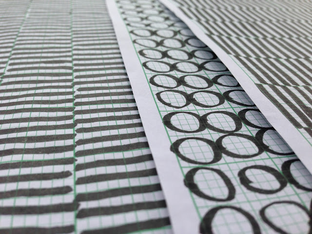
3. Texture
Texture in typography is talking about contrast, form, and space flow of typefaces.

Figure 11 . Adobe Caslon vs Baskerville
From this picture, we can see the differentiate contrast, form, and space flow of two typefaces with same contain text, point size and leading. Adobe Caslon is stronger contrast and less ragged in right side than Baskerville.
4. Leading and Line Length
- Typesize : the correct typeface is can be easy to read when the condition is far distance or close distance without change the point size.
- Leading : is refers to the distance between the baselines of successive lines of type.
- Line Length : is the width of a block of typeset text, usually measured in units of length like inches or points or in characters per line.
First of all, as a designer, we should know that what we create in screen (PC or Laptop) is not same with what we print out in paper. It is often useful to enlarge type to 400% on the screen to get a clear sense of the relationship between descenders on one line and ascenders on the line below. The first thing we should remember that, we should not replaces the correct format text but looking closely first at an actual print out of your work. The best screen is still an electronic approximation of the printed page—unless you are designing for screen, then judging type on screen is accurate.
Lecture 3
23 May 2017 (Week 8)
Type and Typesetting (continue)
In this week, we were continuing lesson before about indicating paragraph, highlighting text, headline within text and cross alignment.
1. Indicating paragraph
- Leading, Line of type, and line spacing diagram
 |
| Figure 12. Leading, line spacing and line of type diagram |
Line leading = Space between upper sentence and bottom sentence
Line of type = Space for typing that we type some sentence
Line spacing = mixed of line leading and line of type
- Pilcrow (¶)
also called the paragraph mark, paragraph sign, paraph, alinea (Latin: a lineā, "off the line"), or blind P, is a typographical character for individual paragraphs. The pilcrow can be used as an indent for separate paragraphs or to designate a new paragraph in one long piece of copy, as Eric Gill did in his 1930s book, An Essay on Typography. The pilcrow was a type of rubrication used in the Middle Ages to mark a new train of thought, before the convention of visually discrete paragraphs was commonplace.
- Widow and Orphans
 |
| Figure 13. Widow and Orphan |
A widow is a very short line – usually one word, or the end of a hyphenated word – at the end of a paragraph or column. Like a widow, an orphan is a single word, part of a word or very short line, except it appears at the beginning of a column or a page.
2. Headline Within Text
Uppercase letter is the better way to make headline. Furthermore, with variation of caps letter is help you to differentiate and read faster. But, only few words okay?
2. Headline Within Text
- Uppercase Letter
 |
| Figure 14. Uppercase Letter |
- Equal Line Width
 |
| Figure 15. Equal Line Width |
This technique is used all time in modern headline design. The idea behind this technique is that you’re really pushing the concept of a headline as a single element. By creating a fixed width column, normally diverse letter shapes and line lengths become a cohesive whole that is easier to work into a larger design.
- Selective Word Emphasis
 |
| Figure 16. Selective Word |
Actually, we’re simply attempting to use size as a major point of contrast. Here we’re emphasizing certain words and de-emphasizing others. It is good that to reduce unimportant words such as "the" or "and". For instance, in the example above, you can see the phrase “Make Some Important” even though that’s not quite what the sentence as a whole says.
- Nestled Text
 |
| Figure 17. Nestled Text |
This sort of headline design is very common in magazine titles. Basically, we type something out in title case and watch the negative space formed between the ascenders. It’s often the perfect place to nudge a word or two into.
3. Cross Alignment
- Measure
 |
| Figure 18. Measure Alignment |
As we can see, A long measure disrupts the rhythm because the reader has a hard time locating the next line of type. The only time a narrow measure is acceptable is with a small amount of text. For optimum readability you want the measure to be between 40-80 characters, including spaces. For a single-column design 65 characters is considered ideal.
- Leading
 |
| Figure 19. Leading Alignment |
Many factors affect leading: typeface, type size, weight, case, measure, wordspacing, etc. The longer the measure, the more leading is needed. Also, the larger the type size, the less leading is required. A good rule is to set the leading 2-5pt larger than the type size, depending on the typeface. So if you set the type at 12pt, a 15pt or 16pt leading should work well on the web.
- Hanging Quotes
 |
| Figure 20. Hanging quotes |
Hang quotes in the margin of the body of text. By not doing so a quotation mark that is flush with the text will interrupt the left margin and disrupt the rhythm of the reader. Hanging quotes keeps the left alignment intact and balanced therefore increasing readability.
- Vertical Rhythm
 |
| Figure 21. Vertical Rhythm |
A baseline grid is the foundation for consistent typographic rhythm on a page. It allows the readers to easily follow the flow of the text, which in turn increases readability. A continuous rhythm in the vertical space keeps all the text on a consistent grid so that proportion and balance are retained throughout the page, no matter the type size, leading or measure.
Instruction
The Brief
A Story Book.
Duration of Assignment
3 Weeks (Briefing on Week 5)
DEADLINE
Week 8 (16 May 2017)
Description
Text:
Tittle: Mister Babadook
If it's in a word or in a look
you can't get rid of the Babadook.
If you're a really clever one
and you know what it is to see
then you can make friends with a special
one,
a friend of you and me.
His name is Mr Babadook
and this is his book.
A rumbling sound then 3 sharp knocks
ba Ba-ba DOOK! DOOK! DOOK! That's
when you'll know he's around.
You'll see him if you look.
See him in your room at night
and you won't sleep a wink.
(whisper: Let me in!)
I'll soon take of my funny disguise
(whisper: Take heed of what you've read...)
and once you see what's underneath...
YOU'RE GOING TO WISH YOU WERE
DEAD.
I'll WAGER with YOU, I'll MAKE you a BET.
The MORE you DENY the STRONGER I GET
(LET ME IN!)
In this project you will be asked to express typographically the content above in a 16-page
booklet. No images are allowed. However some very minor graphical elements, i.e. line,
shade… might be allowed.
Utilising the knowledge gained in the exercises and other modules from the same semester,
you will use illustrator to typographically compose and express the text within a given size.
And, upon completion you will place your illustrator artworks in InDesign to create a digital
ebook utilising the navigation and animation settings to enhance the expressions of your
composed text.
Requirements
The student must document the above progression in their eportfolio and A4 hardcopy
portfolio. The results of the phases must be collated and presented. A thumbnail printout of
all 16 pages, and an ebook for desktop viewing must be produced.
Submission
All gathered information (failures, successes, epiphanies, sketches, visual research,
printouts, websites, images, charts, etc.) documented logically and chronologically in
the A4 Clear Sheet folder. The works must be labelled and dated.
All gathered information (failures, successes, epiphanies, sketches, visual research,
printouts, websites, images, charts, etc.) documented logically and chronologically in
the eportfolio for the duration of the project in one post.
Generated eBook uploaded to the eportfolio and the relevant printouts of the artwork
in the determined formats, in the hardcopy portfolio.
Objectives
An appreciation of the skills sets and mental discipline required in Typography
To develop the necessary software skills for the typographic communication.
Project Tutorial
Tutorial 1 (2 May 2017) - A Story Book
Software Requirement : Adobe inDesign (any version)

Figure 22. Page 1

Figure 23. Page 2-3

Figure 24. Page 4-5

Figure 25. Page 6-7

Figure 26. Page 8-9

Figure 27. Page 10-11

Figure 28. Page 12-13

Figure 29. Page 14-15

Tutorial 2 (9 May 2017) - A Story Book (Continue)
Software Requirment : Adobe inDesign (any version)
 |
| Figure 31. Page 1 |
 |
| Figure 32. Page 2-3 |
 |
| Figure 33. Page 4-5 |
 |
| Figure 34. Page 6-7 |
 |
| Figure 35. Page 8-9 |
 |
| Figure 36. Page 10-11 |
 |
| Figure 37. Page 12-13 |
 |
| Figure 38. Page 14-15 |
 |
| Figure 39. Page 16 |
Software Requirement : Adobe inDesign (any version)
 |
| Figure 40. Final Artwork - Front Page |
 |
| Figure 41. Final Artwork - Middle Page |
 |
| Figure 42. Final Artwork - last page |
Feedback
Week 6
Readable and legibility. But, there is three points that i feel and Mr Vinod said again, again, and again. First, a lack of contrast. The layout that i used is not shows contrast between one page and the other page. Second, divorce or not connecting between one page and the other pages. Thirth, i cant make varitions of layout, if yes, it is divorce again. So, what i've learn this week and i try to keep track is learn and how to use PRINCIPLE OF TYPOGRAPHY. I admit it is hard to use, but it helps me a lot from zero level :)
Week 7
There is a slightly improvement, i can make contrast and and connected each other as storybook. But there is a little bit error which is too many gap in one page. Gap or space is okay, but if too many is not good.
Week 8
Overall good and slightly improvement in layout than before. But, the animation is too slow movie "ba-ba-ba-dook..." and for "Dead" and "Let Me In" are overlapping or cover another word. Furthermore, there is a little gap in second page.
Reflection
Experience
I realised that this first project it would be so hard to achieve a good target. First, i tried by myself how to use inDesign. Because, i had not used Adobe inDesign before. Then, i tried in the first time, thats interesting software but a little bit hard since i never tried before. And then, my fear become reality, everything that i did in the first time was bad and i need redo it several times. At the mid break time, my laptop was broken and i can't do anymore to set up the animation movements yet i did little bit before my laptop was broken. It is hard without any personal device since my laptop is under repair for 2 weeks. Therefore, i need go to campus to do in mac lab. Whereas, my local disk is safety saved, so i can make it portable.
Observation
I noticed that, every single lesson that i got in campus is really important. I know that i can't make assignment better than professional. But, every single skill that i achieved and lesson that i got is strongly help me then old times. I know what is typography world and stuff, how typography work and important units in every single design.
Findings
I should improve my skill than before, i should achieved new knowledge than old times, and of course, i should do more research and read more book to full fill my reference. As we know that, enough knowledge and good skill can beat who the professional one without knowledge.
Refrences
 |
| Figure 43. inkbot.com |
 |
| Figure 44. Design Shack |


Comments
Post a Comment