WEEK 9 - WEEK 10 : PROJECT 2 - FONT DESIGN
30 May 2017 - 6 June 2017 (Week 9 - Week 10)
Aurelia Regina Sutjahjokartiko, (0329953)
Typography and Hypertextuality
Project 2 : Font Design
Lecture 1
30 May 2017 (Week 9)
Font Design
Since my lectures give technical lecture on that day, and they ask us make our own font. Therefore, i chose Futura, but i modified that.
Instruction
The Brief
Font Design.
Duration of Assignment
2 Weeks (Briefing on week 8)
Deadline
Week 10 (30 May, 2017)
Description
You will be expected to design a font of 27 western alphabets along with punctuation marks. To
begin with choose an existing font design that adheres to the direction that you would like to head
in. Study the font carefully by analysing its anatomical parts.
Identify a Form (Basic shapes i.e., Square, Circle, Triangle) this shall be the starting point of your
designs. You may also choose shapes that you see around you or that you like (i.e. an arrow, a
face, a building, etc). One of these shapes will form the basis of your font design. Your font can be
designed to also fulfil a specific need.
Start with rough sketches and upon approval begin digitization of the drawings—software for
digitization shall be determined in class. Artworks shall be printed out for critique sessions followed
by refinements. If time permits we shall generate the font for actual use.
Requirements
The student must utilise the accumulated knowledge from the exercises, lectures and from their
own reading (library books and online sources) to guide them and inform them in their decisions.
The student must document the process (sketches, trial and errors) in their eporfolio and hardcopy
portfolio. The student will be expected to submit the final mock-up in the hardcopy portfolio and
the softcopy PDF (and or JPEG) uploaded or embedded unto the eportfolio. Create a separate
folder in your Google Drive and store all files, artefacts, project submissions, etc. here.
Ensure all items are logically and chronologically ordered, labelled and dated.
Submission
1. All gathered information (failures, successes, epiphanies, sketches, visual research,
printouts, websites, images, charts, etc.) documented logically and chronologically in the
A4 Clear Sheet hardcopy portfolio. The works labelled and dated.
2. All gathered information (failures, successes, epiphanies, sketches, visual research,
printouts, websites, images, charts, etc.) documented logically and chronologically in the
eportfolio for the duration of the project in one post.
3. Images of all the designed alphabets or glyphs on one A3 printed and uploaded.
4. All the glyphs transferred to the determined software, formatted for the purpose of
generation.
Objectives
1. To develop students ability to construct a readable and legible font.
2. To develop students ability to design a font with consistent characteristics.
3. To allow students to experience the various phases of font design.
Project Tutorial
Tutorial 1 (6 June 2017) - Font Design
Software Requirement : Adobe Illustrator and Fontlab Studio 5
Feedback
Week 9
- Tuesday Feedback : Mr Shamsul said that my uppercase "B" letter and uppercase"R" letter is different width stroke. Therefore, he asked me to remake it. But, overall is good and readable
- Wednesday Feedback : Mr Vinod said that my "F" uppercase letter had inappropriate spacing while all uppercase letters are good. Then, my uppercase "B" letter has different width stroke as compared to all letters.
Week 10
- E-portofolio : it is good improvement. For the picture, i need to focus on the work, so i dont need provide long space. Then, for babadook preview, i should create outline.
- Font Design : Overall good, but for letter "w", i need to adjust because the sharp point is overlap of the x-height. Therefore, it is looks weird
Reflection
Experience
Yey! Finally i created my own font ! I am excited (yes of course !). Because i dreamed that i could create my own font based on my style, since i know what EDM (Electronic Dance Music). If you see logo of Avicii, Nicky Romero, Dimtri Vegas, and Krewella, they have sharp / slice pattern for their own logo and i challenged my self to create slice pattern in my typeface mixed with Futura as modern mainstream used typeface. And it is WOW for me because i get more knowledge how to create alphabet, deal with anatomy, and explore more many typeface.
Observation
I feel that explore, research, and more read book can help me to gain new knowledge and experiment to try my understanding. And one more point, i am kind of person who always never confident with my final artwork, because i feel my friend or other person the final artwork are better than me. However, a good final artwork is enough research and knowledge to create that rather just create for fun.
Findings
Still same point, I should improve my skill, gain more knowledge, and more research. Because, it helps me a lot to create something new design. And as we know that, idea is expensive rather copycat from other artist! :)
Refrence
I Love Futura
Aurelia Regina Sutjahjokartiko, (0329953)
Typography and Hypertextuality
Project 2 : Font Design
Lecture 1
30 May 2017 (Week 9)
Font Design
Since my lectures give technical lecture on that day, and they ask us make our own font. Therefore, i chose Futura, but i modified that.
 |
| Figure 1. Futura Font |
 |
| Figure 2. Avicii - Wake Me Up! |
First of all, every typeface has it own charisma. Not only does it presence in design lend an-attribute to the identity of a product or project, but also reflect the taste, personality and attitude of the designer behind. Futura is a geometric sans-serif typeface designed in 1927 by Paul Renner. It was designed as a contribution on the New Frankfurt-project. It is based on geometric shapes that became representative of visual elements of the Bauhaus design style of 1919–33. It was commissioned as a typeface by the Bauer Type Foundry, in reaction to Ludwig & Mayer's seminal Erbar of 1922. Furthermore, Futura has own uniqueness as a font design.
 |
| Figure 3. Futura Anatomy |
About technical lecture, our lecture helps us to create our font. Here, step by step
1. First, open the Fontlab Studio 5
2. Next, click FILE > Font Info > Matric and Dimentions > Key Dimentions
3. Set the x-height with 500 pts. For descender and ascender are depend on your work. (Ascender : 230 pts and Descender : 251 pts)
4. Then, open the one letter that you want, and copy paste from Adobe Illustrator.
Lecture 2
6 June 2017
Font Design
We didnt have proper lecture session, but we have activity which was transfering our font from Adobe Illustrator to Fontlab Studio 5. Our lecture helped us how to set up kerning / tracking letter by letter before we generate font.
Lecture 3
13 June 2017
Font Design
Since no proper lecture session but we have talk on that day, we learnt something from interviewees. His name is Kaith Feng from Melaka and took overseas university in Holland. He had many experience about exhibition outside Malaysia and for me, it is cool breakthrough. Also, he took Graphic Design in Malaysia Institute of Art Kuala Lumpur. Before, he took study in University, he hopeless about his future, but he took opportunity that he had and he try and explore more as a designer. I got something from him, he said that "Just be yourself, dont put other style into your design", thats why he can master all graphic design. I like his style how to make poster with organic pattern, and i try to challenge myself to create poster like that. Here, is his stunning poster
1. First, open the Fontlab Studio 5
2. Next, click FILE > Font Info > Matric and Dimentions > Key Dimentions
3. Set the x-height with 500 pts. For descender and ascender are depend on your work. (Ascender : 230 pts and Descender : 251 pts)
4. Then, open the one letter that you want, and copy paste from Adobe Illustrator.
 |
| Figure 4. Example of Fontlab |
6 June 2017
Font Design
We didnt have proper lecture session, but we have activity which was transfering our font from Adobe Illustrator to Fontlab Studio 5. Our lecture helped us how to set up kerning / tracking letter by letter before we generate font.
Lecture 3
13 June 2017
Font Design
Since no proper lecture session but we have talk on that day, we learnt something from interviewees. His name is Kaith Feng from Melaka and took overseas university in Holland. He had many experience about exhibition outside Malaysia and for me, it is cool breakthrough. Also, he took Graphic Design in Malaysia Institute of Art Kuala Lumpur. Before, he took study in University, he hopeless about his future, but he took opportunity that he had and he try and explore more as a designer. I got something from him, he said that "Just be yourself, dont put other style into your design", thats why he can master all graphic design. I like his style how to make poster with organic pattern, and i try to challenge myself to create poster like that. Here, is his stunning poster
 |
| Figure 5. Bernstein Serenade |
 |
| Figure 6. Mozarts Cello Concert |
 |
| Figure 7. Poster GIF |
Instruction
The Brief
Font Design.
Duration of Assignment
2 Weeks (Briefing on week 8)
Deadline
Week 10 (30 May, 2017)
Description
You will be expected to design a font of 27 western alphabets along with punctuation marks. To
begin with choose an existing font design that adheres to the direction that you would like to head
in. Study the font carefully by analysing its anatomical parts.
Identify a Form (Basic shapes i.e., Square, Circle, Triangle) this shall be the starting point of your
designs. You may also choose shapes that you see around you or that you like (i.e. an arrow, a
face, a building, etc). One of these shapes will form the basis of your font design. Your font can be
designed to also fulfil a specific need.
Start with rough sketches and upon approval begin digitization of the drawings—software for
digitization shall be determined in class. Artworks shall be printed out for critique sessions followed
by refinements. If time permits we shall generate the font for actual use.
Requirements
The student must utilise the accumulated knowledge from the exercises, lectures and from their
own reading (library books and online sources) to guide them and inform them in their decisions.
The student must document the process (sketches, trial and errors) in their eporfolio and hardcopy
portfolio. The student will be expected to submit the final mock-up in the hardcopy portfolio and
the softcopy PDF (and or JPEG) uploaded or embedded unto the eportfolio. Create a separate
folder in your Google Drive and store all files, artefacts, project submissions, etc. here.
Ensure all items are logically and chronologically ordered, labelled and dated.
Submission
1. All gathered information (failures, successes, epiphanies, sketches, visual research,
printouts, websites, images, charts, etc.) documented logically and chronologically in the
A4 Clear Sheet hardcopy portfolio. The works labelled and dated.
2. All gathered information (failures, successes, epiphanies, sketches, visual research,
printouts, websites, images, charts, etc.) documented logically and chronologically in the
eportfolio for the duration of the project in one post.
3. Images of all the designed alphabets or glyphs on one A3 printed and uploaded.
4. All the glyphs transferred to the determined software, formatted for the purpose of
generation.
Objectives
1. To develop students ability to construct a readable and legible font.
2. To develop students ability to design a font with consistent characteristics.
3. To allow students to experience the various phases of font design.
Project Tutorial
Tutorial 1 (6 June 2017) - Font Design
Software Requirement : Adobe Illustrator and Fontlab Studio 5
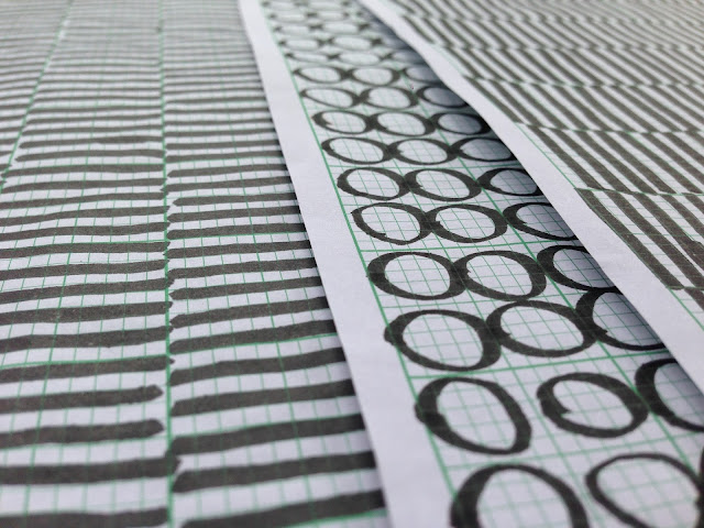
 |
| Figure 8. Sketch of alphabet |
 |
| Figure 9. Sketch of number and punctuation |
 |
| Figure 10. First try of digitalize (Adobe Illustrator) |
Tutorial 2 (13 June 2017) - Font Design (submission)
Software Requirment : Adobe Illustrator and Fontlab Studio 5
 |
| Figure 11. Second try of digitalize (Adobe Illustrator) |
 |
| Figure 12. Alphabet on Fontlab Studio 5 |
 |
| Figure 13. Preview before export as font |
 |
| Figure 14. The Final Result - Avelia |
Feedback
Week 9
- Tuesday Feedback : Mr Shamsul said that my uppercase "B" letter and uppercase"R" letter is different width stroke. Therefore, he asked me to remake it. But, overall is good and readable
- Wednesday Feedback : Mr Vinod said that my "F" uppercase letter had inappropriate spacing while all uppercase letters are good. Then, my uppercase "B" letter has different width stroke as compared to all letters.
Week 10
- E-portofolio : it is good improvement. For the picture, i need to focus on the work, so i dont need provide long space. Then, for babadook preview, i should create outline.
- Font Design : Overall good, but for letter "w", i need to adjust because the sharp point is overlap of the x-height. Therefore, it is looks weird
Reflection
Experience
Yey! Finally i created my own font ! I am excited (yes of course !). Because i dreamed that i could create my own font based on my style, since i know what EDM (Electronic Dance Music). If you see logo of Avicii, Nicky Romero, Dimtri Vegas, and Krewella, they have sharp / slice pattern for their own logo and i challenged my self to create slice pattern in my typeface mixed with Futura as modern mainstream used typeface. And it is WOW for me because i get more knowledge how to create alphabet, deal with anatomy, and explore more many typeface.
Observation
I feel that explore, research, and more read book can help me to gain new knowledge and experiment to try my understanding. And one more point, i am kind of person who always never confident with my final artwork, because i feel my friend or other person the final artwork are better than me. However, a good final artwork is enough research and knowledge to create that rather just create for fun.
Findings
Still same point, I should improve my skill, gain more knowledge, and more research. Because, it helps me a lot to create something new design. And as we know that, idea is expensive rather copycat from other artist! :)
Refrence
I Love Futura
 |
| Figure 15. A I Love Futura |
This book is good because this book provide example function of Futura. There is some explanation how to use futura on packaging, album design, bookmark, and many more. As a modern font, this font is multifunction to use. Because, this font used for deliver strong sentence / design and it is effective. For example
 |
| Figure 16. (left to right) BCAD book & Chronic book |
- BCAD, Bethem Crouwel 1979 - 2009 (Book)
Design : Studio Laucke (Dirk Laucke, Johanna Sibein)
Monograph on the occasion of bent hem Crowed Architects' 30 years.
- Chronic 2007 (Book)
Design : Studio Laucke (Dirk Laucke, Johanna Sibein)
"This exhibition - the artists' work - discuss the field of tension between colonialism and modernism. The Futura as an icon of western ideas of 'good and beauty' fits very well"
 |
| Figure 17. Artic Paper |
- Artic Paper 2008 (Paper Sculpture, Photography)
Design : Shaz Madani
It is very unique to applicate Futura as typeface into paper sculpture. This design artwork used for campaign that campaign was to illustrate the beauty and flexibility of their paper range and showcase how paper can be a great medium for expressing the qualities and the tone of a message as well as bringing images and ideas to life.
 |
| Figure 18. Hypetype.co.uk |
- Hype Type Studio Self Promotion 2009 (Identity)
"The geometric shapes simplicity and clarity of the letters"
I feel that design artworks is very clever way to combine Futura and Stencil fonts. Therefore, as a consumer feel this identity as "hip-hop" or "street" style inside this logo.


Comments
Post a Comment