WEEK 11 - 13 : FINAL PROJECT - KINETIC TYPOGRAPHY
20 June - 4 July2017 (Week 11 - Week 13)
Aurelia Regina Sutjahjokartiko, (0329953)
Typography and Hypertextuality
Final Project : Kinetic Typography
Lecture 1
20 June 2017 (Week 12)
- No Lecture Session -
Lecture 2
4 July 2017 (Week 13)
- No Lecture Session -
Instruction
The Brief
Kinetic Typography
Duration of Assignment
3 Weeks (Briefing on Week 10)
DEADLINE
Week 13 (27 Jun 2017)
Description
In this Final Project you may use the font you designed in the previous project and give voice to it.
You will be required to choose a statement / poem / quote / dialog / etc. that is suitable to the
character and personality of your font. You will design a static and animated Poster.
“Kinetic typography—the technical name for "moving text"—is an animation technique mixing
motion and text to express ideas using video animation. This text is presented over time in a
manner intended to convey or evoke a particular idea or emotion.”
(https://www.youtube.com/watch?v=HQ_DRSuk5tk)
You will research, plan and execute a sequence of frames expressing the chosen text using the
appropriate software. The static Poster is to be printed in A4 while the animated Poster is to be
uploaded to your eportfolio.
Requirements
The student must utilise the accumulated knowledge from the exercises, lectures and from their
own reading (library books and online sources) to guide them and inform them in their decisions.
The student must document the process (sketches, trial and errors) in their eporfolio and hardcopy
portfolio. The student will be expected to submit the final mock-up in the hardcopy portfolio and
the softcopy PDF (and or JPEG) uploaded or embedded unto the eportfolio. Create a separate
folder in your Google Drive and store all files, artefacts, project submissions, etc. here.
Ensure all items are logically and chronologically ordered, labelled and dated.
Submission
1. All gathered information (failures, successes, epiphanies, sketches, visual research,
printouts, websites, images, charts, etc.) documented logically and chronologically in the
A4 Clear Sheet folder. The works must be labelled and dated.
2. All gathered information (failures, successes, epiphanies, sketches, visual research,
printouts, websites, images, charts, etc.) documented logically and chronologically in the
eportfolio for the duration of the project in one post and for the duration of the course in a
separate post as instructed in class.
3. Softcopy of the animation must be uploaded unto the eportfolio or YouTube and
embedded in the eportfolio (or as directed by your lecturers) while a frame-by-frame JPEG
of the kinetic animation must also be uploaded to your eportfolio.
4. The frame-by-frame animation needs to be printed out and documented in the hardcopy
portfolio.
Objectives
1. To develop students ability to express ideas through text in moving forms.
2. To develop students ability to create seamless movement from one frame to another.
3. To develop students ability to maintain excitement and variation in the presented
animation.
Project Tutorial
Tutorial 1 (20 June 2017) - Kinetic Typography (Poster)
Sotfware Requirment : Adobe Illustrator
To be honest, i created this poster because i didnt read the module outline, but I was influenced by my senior who take semester 2 in Graphic design. She told me that she ever made font poster and i had looked that her poster. But, Mr Shamsul told me that my first poster is not a correct one. Gratefuly, i created another one before i showed to him.
Feedback
Week 11
- E-portofolio : it is good improvement. For the picture, i need to focus on the work, so i dont need provide long space. Then, for babadook preview, i should create outline.
- Font Design : Overall good, but for letter "w", i need to adjust because the sharp point is overlap of the x-height. Therefore, it is looks weird
Week 12
- E-portofolio : Good blog ! and Mr. Vinod suggest me that if i have any changes progression of any letter, i should show on my blog. In addition, if Mr Vinod / someone click in "Typography and Hypertextuality", it supposed to be one list not one whole post.
- Font Design : Overall is good. But, there is certain issue such as thick stroke issue, sharp point on "W" letter and kerning /tracking.
- Poster : It is minimalist and Mr VInod - Mr Shamsul liked it. But i need more create other poster, so i didnt stuck with one style.
Week 13
The animation it was good, but for flickering words it takes too long for it, so i should make short one. And the size supposed to be potrait not landscape. (As i mentioned before, there is misunderstanding between Mr Vinod and Mr Shamsul itself)
Reflection
Experience
Yey! Finaly i am in the end of stage ! I feel excited because i will created kinetic typography. I had dream that last 2 years ago. I want create kinetic typography but my device was not suitable for animation at that time. I was convincing my parents that i can prove i can create animation with new device. And i used this chance to learn how create kinetic typography (hehe not the real one), Thank you mr Vinod and Mr Shamsul for this precious chance !
Observation
I feel that i kind of moody person. When i like the module, i will give best performance than before, but when i dont like the module, i will do assigment with badmood one, so the result is re-do everything.
Findings
Still the same point in previous post, I should do more research, gain more knowledge, do the best every chances that lecture given to me, and more explore!
References
Aurelia Regina Sutjahjokartiko, (0329953)
Typography and Hypertextuality
Final Project : Kinetic Typography
Lecture 1
20 June 2017 (Week 12)
- No Lecture Session -
Lecture 2
4 July 2017 (Week 13)
- No Lecture Session -
Instruction
The Brief
Kinetic Typography
Duration of Assignment
3 Weeks (Briefing on Week 10)
DEADLINE
Week 13 (27 Jun 2017)
Description
In this Final Project you may use the font you designed in the previous project and give voice to it.
You will be required to choose a statement / poem / quote / dialog / etc. that is suitable to the
character and personality of your font. You will design a static and animated Poster.
“Kinetic typography—the technical name for "moving text"—is an animation technique mixing
motion and text to express ideas using video animation. This text is presented over time in a
manner intended to convey or evoke a particular idea or emotion.”
(https://www.youtube.com/watch?v=HQ_DRSuk5tk)
You will research, plan and execute a sequence of frames expressing the chosen text using the
appropriate software. The static Poster is to be printed in A4 while the animated Poster is to be
uploaded to your eportfolio.
Requirements
The student must utilise the accumulated knowledge from the exercises, lectures and from their
own reading (library books and online sources) to guide them and inform them in their decisions.
The student must document the process (sketches, trial and errors) in their eporfolio and hardcopy
portfolio. The student will be expected to submit the final mock-up in the hardcopy portfolio and
the softcopy PDF (and or JPEG) uploaded or embedded unto the eportfolio. Create a separate
folder in your Google Drive and store all files, artefacts, project submissions, etc. here.
Ensure all items are logically and chronologically ordered, labelled and dated.
Submission
1. All gathered information (failures, successes, epiphanies, sketches, visual research,
printouts, websites, images, charts, etc.) documented logically and chronologically in the
A4 Clear Sheet folder. The works must be labelled and dated.
2. All gathered information (failures, successes, epiphanies, sketches, visual research,
printouts, websites, images, charts, etc.) documented logically and chronologically in the
eportfolio for the duration of the project in one post and for the duration of the course in a
separate post as instructed in class.
3. Softcopy of the animation must be uploaded unto the eportfolio or YouTube and
embedded in the eportfolio (or as directed by your lecturers) while a frame-by-frame JPEG
of the kinetic animation must also be uploaded to your eportfolio.
4. The frame-by-frame animation needs to be printed out and documented in the hardcopy
portfolio.
Objectives
1. To develop students ability to express ideas through text in moving forms.
2. To develop students ability to create seamless movement from one frame to another.
3. To develop students ability to maintain excitement and variation in the presented
animation.
Project Tutorial
Tutorial 1 (20 June 2017) - Kinetic Typography (Poster)
Sotfware Requirment : Adobe Illustrator
 |
| Figure 1. First poster with color scheme |
 |
| Figure 2. Final Artwork for first attempt |
 |
| Figure 3. Final Artwork for second attempt |
 |
| Figure 4. Decoration and color development |
 |
| Figure 5. The Correct Final |
About color, yes it same with previous poster before. Therefore, that color scheme is very suitable with my typefaces.
Tutorial 2 (4 July 2017) - Kinetic Typography (Animation)
Software Requirments : Adobe After Effect
 |
| Figure 6. Layer for 1080 px size |
 |
| Figure 7. keyframe for 1080px size |
Figure 8. First attempt of final animation
Since the last class that attend was not enough time to create this animation, i fixed my animation
Figure 9. Final animation of 1080px
As we know that, Mr Vinod and Mr Shamsul had misundestanding about size for this animation, so for better for sake, i created the potrait one
 |
| Figure 10. layer for potrait size |
 |
| Figure 11. keyframe for potrait size |
Figure 12. Final animation for potrait size
The reason why i put my name in landscape size but not in potrait size because, as we know that, the landscape size is not the actual size for poster, so i can created based on my creativity and i created it, so i can put my name there :D. Futhermore, the poster that i created is about "the night". As we know that, we can see lamp, sparkling star, and flickering lamp at the night. So the night itself with flickering lamp and sparkling two triangles represent situation in the night.
Feedback
Week 11
- E-portofolio : it is good improvement. For the picture, i need to focus on the work, so i dont need provide long space. Then, for babadook preview, i should create outline.
- Font Design : Overall good, but for letter "w", i need to adjust because the sharp point is overlap of the x-height. Therefore, it is looks weird
Week 12
- E-portofolio : Good blog ! and Mr. Vinod suggest me that if i have any changes progression of any letter, i should show on my blog. In addition, if Mr Vinod / someone click in "Typography and Hypertextuality", it supposed to be one list not one whole post.
- Font Design : Overall is good. But, there is certain issue such as thick stroke issue, sharp point on "W" letter and kerning /tracking.
- Poster : It is minimalist and Mr VInod - Mr Shamsul liked it. But i need more create other poster, so i didnt stuck with one style.
Week 13
The animation it was good, but for flickering words it takes too long for it, so i should make short one. And the size supposed to be potrait not landscape. (As i mentioned before, there is misunderstanding between Mr Vinod and Mr Shamsul itself)
Reflection
Experience
Yey! Finaly i am in the end of stage ! I feel excited because i will created kinetic typography. I had dream that last 2 years ago. I want create kinetic typography but my device was not suitable for animation at that time. I was convincing my parents that i can prove i can create animation with new device. And i used this chance to learn how create kinetic typography (hehe not the real one), Thank you mr Vinod and Mr Shamsul for this precious chance !
Observation
I feel that i kind of moody person. When i like the module, i will give best performance than before, but when i dont like the module, i will do assigment with badmood one, so the result is re-do everything.
Findings
Still the same point in previous post, I should do more research, gain more knowledge, do the best every chances that lecture given to me, and more explore!
References
 |
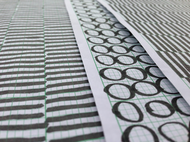
| Figure 13. Poster tips |
 |
| Figure 14. Color Scheme resource |


Comments
Post a Comment