WEB DESIGN AND NEW MEDIA - ASSIGNMENT 1
28 August - 18 September 2017 (Week 1- Week 4)
Aurelia Regina Sutjahjokartiko, (0329953)
Web Design and New Media
First Assignment : Landing Page Design
Lecture 1
5 September 2017
Good Web Design and Bad Web Design
Before we create the real website, we need to know basicly what is the good website it self. On this day, Mr Shamsul give exercise to us for give 5 example for good websites and another 5 example for bad websites with additional reason and this exercise is in group. After we did it, we know that what characters of bad and good website.
Character for good website :
-good choice of typography (easy to read, and visually appealing)
-has clear purpose
-targets the right target market, designed for users
-contains the necessary information
-use the right images (relevant)
-utilize negative spaces well
-loads fast
-visually interesting and engaging
-good color scheme
-good interactivity
Character for bad website :
-too much animation
-outdated design
-too much menus and submenus
-too much texts
-lack of negative space, overly packed
-confusing, has no clear purpose
-dull color scheme
-not enough information
-unorganized or messy layout
Lecture 2
11 September 2017
Introduce HTML and HTML5
Web sites are built around basic structural themes. These fundamental architectures govern the navigational interface of the Web site and mold the user's mental models of how the information is organized. Three essential structures can be used to build a Web site: sequences, hierarchies, and webs. (source : http://webstyleguide.com)
Absolute path is the path that need full adress/ full path and same adress precisely where is come from that file. By the contrast, relative path is the path that it doesnt need full path like absolute path. A filename can be considered as a relative path based at the current working directory. If the working directory is not the file's parent directory, a file not found error will result if the file is addressed by its name.
Instruction
First assignment - Landing page design (20%) Due date- Week 4
Choose the subject matter given and design ONE (1) landing page for each subject. Each design should be able to present what the company does clearly. Be creative yet able to describe the page usability and information structure distinctly. Look for inspiration and refer from other establish website to have better idea on the design. Propose the product and service that you chose to your lecturer before you start to design the final artwork.
Topic
• Product
• Service
You can choose any existing local company for the assignment and use all the information and images from the Websites.
Requirement
Landing page dimension should not exceed 1024 X 768 pixels*. Color mode RGB. File resolution must be 72dpi. Each file size should not exceed 10MB.
Objective
The objective of this assignment is to be able to ensure that the student understand the important element in website design.
Submission Requirement
Please convert the file to .pdf or .jpeg and upload the files in TImES within the given time.
*Page height maybe extended depending on the content
Exercise
Exercise 1 (12 September 2017) - Introduce HTML
Project Progression
Feedback (for this assignment 1)
For the final artwork, especially for service , i made wrong alignment so Mr. Shamsul asked me to redo for the alignment and also for the last picture (the great wall thigny) doesnt represent the "package and promo". So, he asked me to redo it.
Aurelia Regina Sutjahjokartiko, (0329953)
Web Design and New Media
First Assignment : Landing Page Design
Lecture 1
5 September 2017
Good Web Design and Bad Web Design
Before we create the real website, we need to know basicly what is the good website it self. On this day, Mr Shamsul give exercise to us for give 5 example for good websites and another 5 example for bad websites with additional reason and this exercise is in group. After we did it, we know that what characters of bad and good website.
Character for good website :
-good choice of typography (easy to read, and visually appealing)
-has clear purpose
-targets the right target market, designed for users
-contains the necessary information
-use the right images (relevant)
-utilize negative spaces well
-loads fast
-visually interesting and engaging
-good color scheme
-good interactivity
Character for bad website :
-too much animation
-outdated design
-too much menus and submenus
-too much texts
-lack of negative space, overly packed
-confusing, has no clear purpose
-dull color scheme
-not enough information
-unorganized or messy layout
Lecture 2
11 September 2017
Introduce HTML and HTML5
- History of Internet and Website
- Basic HTML
Generally, HTML has formula for their elements. This is the formula fpr the element
<p> and </p>
the yellow color is left bracket and right bracket, the green one is character that we use it and the blue one is called forward slash to close the elements
How to use?
<elements>information</elements>
Basicly, the information stand between opening tag (element) and close tag. This formula to tell the browser that this information should be show and stand as creator wants.
There is a lot of elements in HTML, but Mr Shamsul give us more than 5 tags as the basic.
1. <html></html> is for the opening and closing html and tells the browser that the information is HTML type.
2. <head></head> is for head HTML
3.<title></title> is the formula that we know what title of the website. It will appears in tab on browser.
4.<body></body> is for body HTML
5.<article></article> is new feature to tell browser that the text is article type.
6.<em></em> is for emphasize text
7.<a href="http://www.google.com" title="link to google">text</a> is for link to google when the user click it
 |
| Figure 1. using link elements in notepad |
 |
| Figure 2. in browser |
8. <b></b> for bold the text
9. <i></i> for italic the text
10. <u></u> for underline the text
11. <ul></ul> for unordered list
12. <ol></ol> for ordered list
 |
| Figure 3. How to use unordered list tag in notepad |
 |
| Figure 4. in browser |
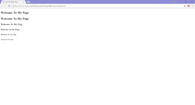
13. <h1> until <h6> is for heading and close with closing tag
 |
| Figure 5. using heading in notepad |
 |
| Figure 6. in browser |
Lecture 3
18 September 2017
Organizing a Website
Organizing a Website
- Organizing a Website
Key of succesful website is to organize the information logically. The first step in organizing a website is a concept called "chunking". Every website has information architecture.
- Site Structure
Figure 7. Straight Linear site structure
|
- Absolute Path vs Relative Path
Absolute path is the path that need full adress/ full path and same adress precisely where is come from that file. By the contrast, relative path is the path that it doesnt need full path like absolute path. A filename can be considered as a relative path based at the current working directory. If the working directory is not the file's parent directory, a file not found error will result if the file is addressed by its name.
Lecture 4
25 September 2017
Extra Markup and Introduction to CSS
In this day, we learnt and getting more know about CSS element and what the different of ID attribute and class atribute. Also, we learnt about CSS Embed style.
Extra Markup and Introduction to CSS
In this day, we learnt and getting more know about CSS element and what the different of ID attribute and class atribute. Also, we learnt about CSS Embed style.
- ID and class attribute
The id attribute specifies a unique id for an HTML element, so it looks like different with other. For example, the website contain all paragraph is left alignment, but the creator wants to make the last paragraph is right alignment, so he/she used ID attribute. Otherwise, The class attribute specifies one or more classnames for an element. For instance, the website contains paragraph and picture, but the creator wants all pictures in right side and all paragraph in left side, so he/she used class attribute.
- Block and Inline elements
Block element is elements will always appear to start on a new line in the browser window.
Example : <h1>, <p>, <ul> and <li>
Inline element is elements will always appear to continue on the same line as their neighbouring elements.
Example : <b>, <i>, <em>, <a> and <img>
- CSS Embed style
Embedded style sheets refer to when you embed style sheet information into an HTML document using the <style> element. It will work by embedding the style sheet information within <style></style> tags in the head of your document. Basicly, it will place between <head></head> tags of HTML document.
Instruction
First assignment - Landing page design (20%) Due date- Week 4
Choose the subject matter given and design ONE (1) landing page for each subject. Each design should be able to present what the company does clearly. Be creative yet able to describe the page usability and information structure distinctly. Look for inspiration and refer from other establish website to have better idea on the design. Propose the product and service that you chose to your lecturer before you start to design the final artwork.
Topic
• Product
• Service
You can choose any existing local company for the assignment and use all the information and images from the Websites.
Requirement
Landing page dimension should not exceed 1024 X 768 pixels*. Color mode RGB. File resolution must be 72dpi. Each file size should not exceed 10MB.
Objective
The objective of this assignment is to be able to ensure that the student understand the important element in website design.
Submission Requirement
Please convert the file to .pdf or .jpeg and upload the files in TImES within the given time.
*Page height maybe extended depending on the content
Exercise
Exercise 1 (12 September 2017) - Introduce HTML
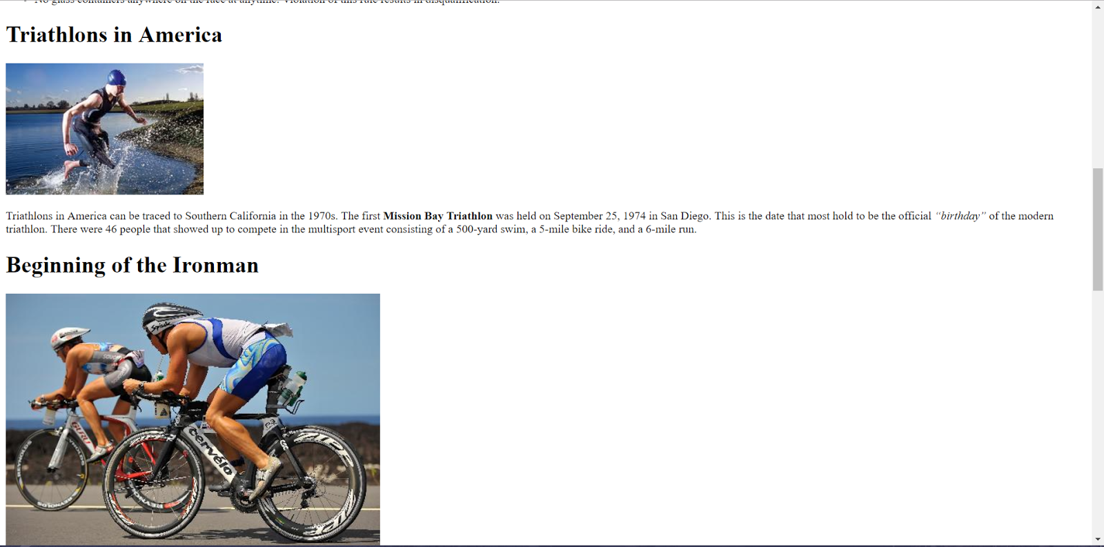
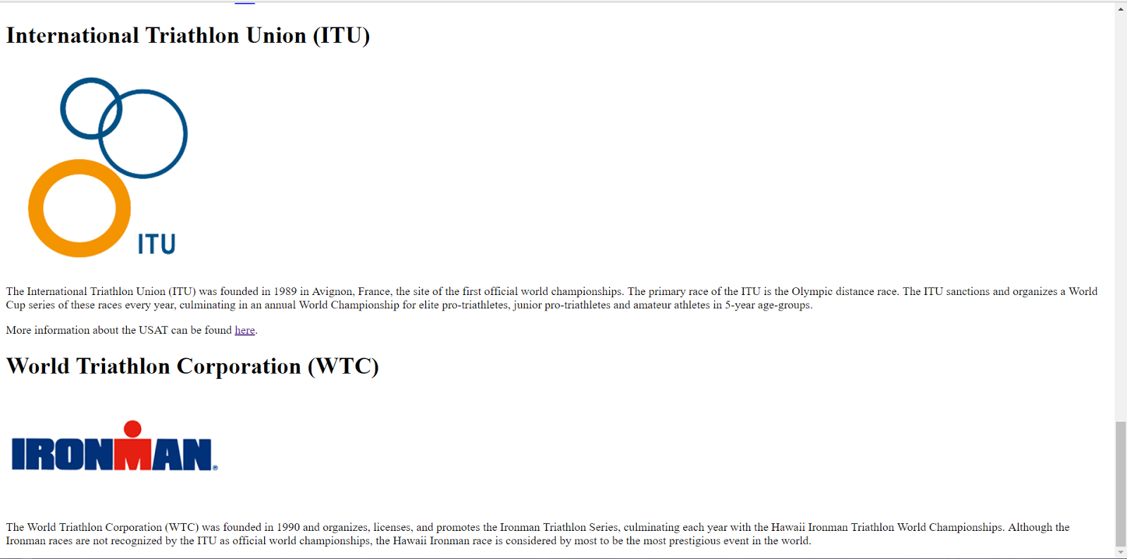
 |
| Figure 9. Exercise in notepad (1) |
 |
| Figure 10. Exercise in notepad (2) |
 |
| Figure 11. The result of exercise (1) |
 |
| Figure 12. The result of exercise (2) |
 |
| Figure 13. The result of exercise (3) |
 |
| Figure 14. The result of exercise (4) |
 |
| Figure 15. The result of exercise (5) |
 |
| Figure 16. The result of exercise (6) |
Project Progression
- Wireframe (which are approved by Mr. Shamsul)
 |
| Figure 17. Wireframe for product |
 |
| Figure 17. Wireframe for Service |
- Final Artwork
Feedback (for this assignment 1)
For the final artwork, especially for service , i made wrong alignment so Mr. Shamsul asked me to redo for the alignment and also for the last picture (the great wall thigny) doesnt represent the "package and promo". So, he asked me to redo it.
 |
| Figure 20. wrong final artwork |


Comments
Post a Comment